


ROLE
Product Designer
TIMELINE · TEAM
4 Weeks · 4 Interdisciplinary Product Designers
MY CONTRIBUTIONS
Project Management, Desk Research, Interview Moderation, Synthesis, Concept Development, User Flow, Lo-Fi, Board Game Play-Test Facilitation, Iteration.
THE PROBLEM
Women from conservative backgrounds had no safe space to discuss reproductive health. All 6 interview participants described feeling unsafe and shameful to discuss it. The silence was cultural, generational, and compounding.
THE SOLUTION
Designed a board game and companion app that gave women from conservative cultural backgrounds a safer way to discuss sexual and reproductive health. The experience combined guided conversation, an AI companion, access to a verified doctor, and an escalation flow that carried context into pre-appointment notes.
RESULT · AT A GLANCE
Participants described feeling unsafe talk about women’s reproductive health to someone else.
Engaged with the physical board game during public showcase.
"I love this so much, I wish I had this game growing up."
Companion mobile app concept grounded in user research and ready for future development.
01 — SITUATION
Women’s sexual and reproductive health is broadly stigmatized, rarely discussed openly, and deeply tied to cultural shame across many communities. Each of us grew up in a different country and culture, yet we all learned about reproductive health in whispers and through guesswork. Realizing this shared silence was not unique led us to ask:
I took ownership of project management because it is genuinely how I work best. I am the kind of person who needs a task list to feel oriented, and in a team setting, that instinct becomes useful. When I can see the full timeline laid out, I know where we are, what is at risk, and what needs to move. In a four-week sprint with four designers working on a complex and sensitive problem, I knew structure would not slow us down. It would keep us from losing sight of one another, or the work.
Alongside managing the sprint, I designed the app’s Chat experience end-to-end. This included the AI health companion, the direct connection to a verified doctor, and the escalation flow that carries the user’s context into the doctor chat. I also designed the pre-appointment notes experience so women could explain what they were going through before the conversation began.
Together, our core challenge was:
02 — RESEARCH
Each team member began with independent desk research. I used Perplexity AI to surface relevant studies quickly, then reviewed the original sources myself. Research on migrant and refugee women showed that language barriers, cultural and religious taboos, and fear of judgment can prevent women from discussing reproductive health or seeking care. A 2024 review of 134 studies also found that this silence can persist across generations, while while Centers for Disease Control and Prevention and Kaiser Family Foundation data showed that cultural and communication gaps can make it harder for patients to understand and be understood.
With our hypothesis supported by desk research, we moved into user interviews. When a teammate suggested recruiting friends abroad, I pushed back. In a four-week sprint, international time zones would add unnecessary complexity, and the U.S. already offered the cultural diversity we needed. The team agreed, and my recommendation helped refine our criteria: women living in the U.S. who were born and raised elsewhere, so their relationship with reproductive health had been shaped outside the U.S. sex education system.
Our screener received 14 responses from women ages 18-40 across diverse cultural backgrounds. Their answers confirmed that silence around reproductive health was a shared experience, with consistent reasons behind their discomfort:


We moved forward and conducted 6 user interviews remotely through Zoom. I moderated 4 of the 6. Our participants spanned Chinese, Korean, Arab, and Indian cultural backgrounds, all living in the US. All 6 described feeling unsafe discussing reproductive health in their families or communities growing up.
The team synthesized all 6 interviews together in FigJam, clustering findings until 12 themes emerged. Four patterns directly shaped the design direction:
Women confided in friends before family
Cultural and generational silence had compounded over time
Women sought health information online before going to doctors
Anonymous spaces lowered the stakes enough to open up.
DESIGN INSIGHT
Design solution needed to be private by default, culturally aware, and designed so that a woman could get as close as she felt ready for, no more, no less.
03— IDEATION

Each team member generated How Might We questions, and we narrowed them to three opportunities: helping women discuss sensitive health topics without fear of judgment, creating spaces where learning about reproductive health feels normal, and helping women connect fragmented knowledge about their bodies.
Each team member came back with ideas and the range was wide: storytelling platforms, health trackers, infographic inserts in tampon and pad boxes, AR learning posters in public spaces, a platform to recommend healthcare providers by cultural background, an anonymous buddy system, and a card game. Every idea was trying to answer the same underlying need through a different shape.

TWO IDEAS I BROUGHT
A culturally-sensitive provider matching system where women could find doctors filtered by language, cultural background, and openness to sensitive topics.
A pre-appointment preparation feature where women could write down their concerns before an appointment, with those notes summarized and sent directly to their provider before the session began.
The research had shown that women spent energy in clinical settings explaining context that should have already been understood, and that many avoided appointments altogether because they could not say what they needed to say out loud. This feature was designed to remove that friction.
One teammate proposed a card game to start conversations around women’s health. I agreed immediately. I had played a conversational card game before and found myself saying things out loud I had never said to anyone. The game had prompted me, not the person across the table, which meant nobody had to choose to be brave. But from my own experience I also knew a card game without structure would not hold. I researched how to give a conversational game enough structure to feel safe and deliberate rather than random, and the findings pointed to combining the card format with a board structure where the game, not the player, decided what came up next.
So we built a board game, not as a standalone product, but as the fastest way to test our core hypothesis: that structure, safety, and the right prompts could unlock conversations women had never felt able to have out loud. In parallel, we designed a companion app to help those conversations continue beyond the game.

Board game brainstorming

Companion app brainstorming
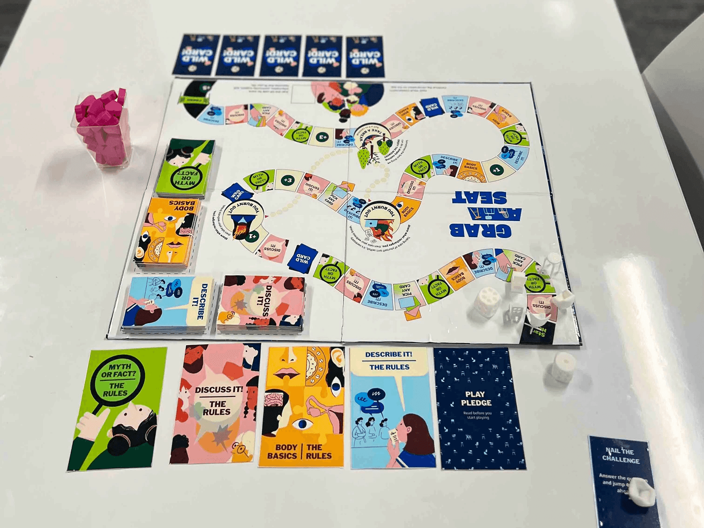
Once the concept was locked, the team moved into designing how the game actually works. The mechanics we landed on:
04 — CHAT FEATURE DESIGN
The board game could start a conversation. It could not follow a woman home, connect her to a doctor, or give her a place to ask questions at 2am when she was scared and alone. The app was designed to do all of that. Every feature maps directly to what the research uncovered: women needed privacy, no judgment, and someone worth trusting.
USER ONBOARDING
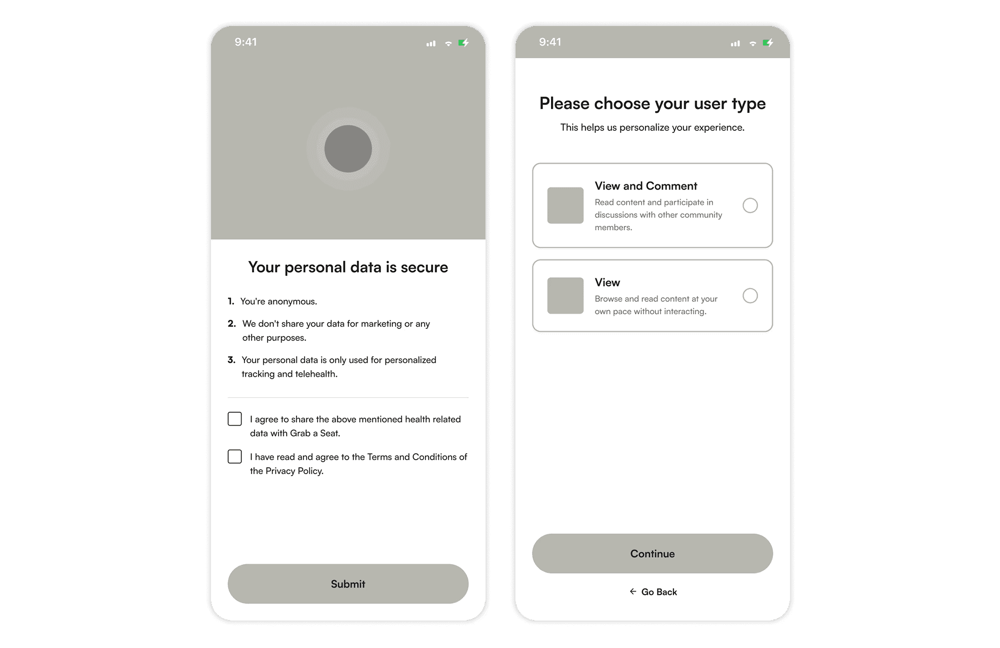
Privacy statement and user visibility for onboarding
Before a user sees any content, the app tells her what it offers and shows a privacy statement. Then it asks one question: how do you want to show up? View and comment, or view only.
The research had shown that women needed control over how much they exposed themselves before they felt safe. Giving women that choice before they see any content meant the app was not asking them to trust it yet. It was showing them they were in control.
ANONYMOUS COMMUNITY AND SIGNED UP USER BEHAVIOR
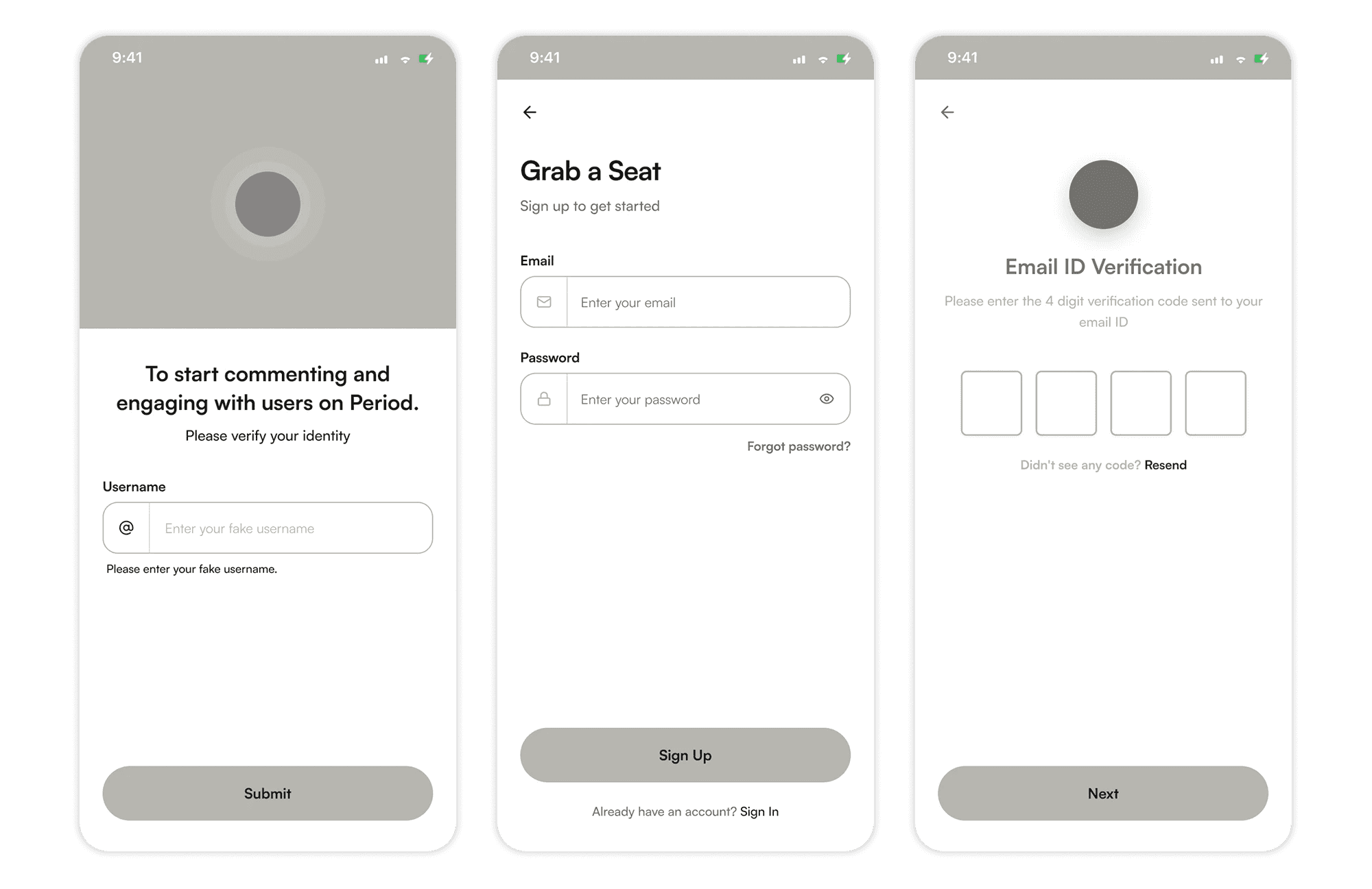
Anonymous community username; Verified account required for secure doctor chat.
The anonymous community was a team design decision grounded in a clear research insight. One participant explained, “The fact that I don’t know who I’m talking to, and probably won’t meet them again, makes it easier to share without feeling judged.”
To preserve that sense of safety, every user receives a pseudonymous username. The community works like a forum built specifically for women’s health, where anyone can read discussions, while signed-in users can comment, connect with others, and talk with doctors.
THE ENTRY POINT OF CARE: LUNA VS. DOCTOR
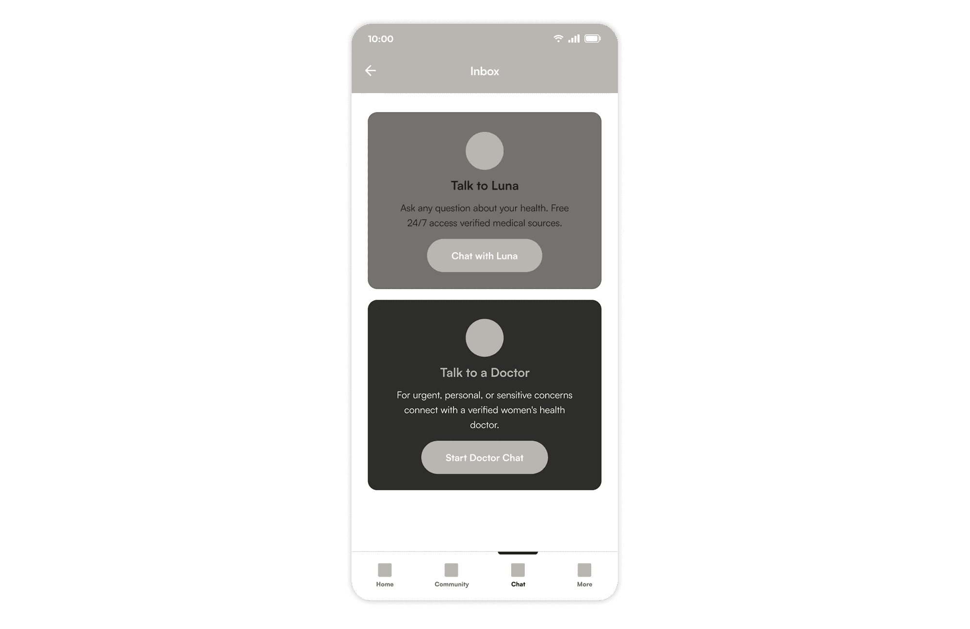
One chat entry point, with the choice to talk to Luna or a doctor.
The app is organized around four tabs: Home, Community, Chat, and Account. The Chat tab houses both support options. Tapping it opens an inbox where users can choose to talk to Luna or connect with a doctor. Some women know they need professional help, while others may not be ready for that step. This entry point lets each user decide how to begin a conversation that may still feel stigmatized.
ASK LUNA: AI HEALTH COMPANION
Luna offers 24/7 guidance and seamlessly connects serious concerns to a doctor with the full context already shared.
Luna is an AI health companion available around the clock with access to verified medical sources. A user can ask anything, give context, and Luna responds with relevant articles from within the app.
The interaction I designed most carefully was the escalation moment. When a user mentions something serious, like severe pain, Luna detects the severity and asks whether they would like to speak with a doctor. If they say yes, Luna transfers the conversation to a doctor chat and carries the context with it. The doctor chat opens with a summary already visible: “You wrote: irregular period, mood swings, severe pain.” The doctor has read the context before responding.
The research had shown that shame and fear of judgment were the primary reasons women avoided seeking professional medical help for reproductive health concerns. The context-carrying handoff was designed with that in mind. When Luna detects severity and suggests a doctor, it is not just a technical escalation. It is the app telling the woman that what she is experiencing is serious enough to deserve professional care, without her having to overcome the shame of asking for it herself.
CULTURAL PROVIDER MATCHING WITH PRE-APPOINTMENT NOTE
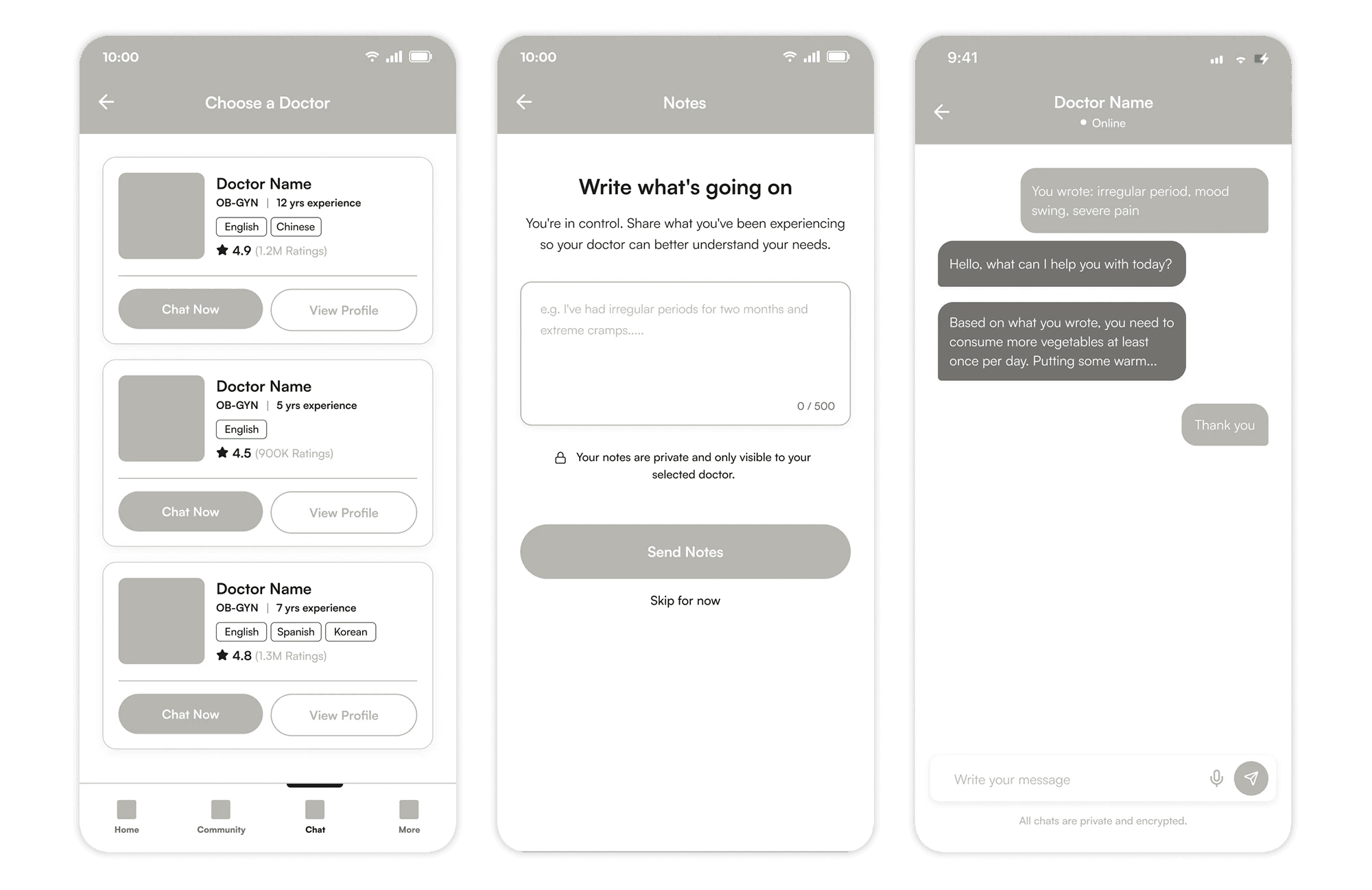
Find a culturally aligned doctor, share private notes upfront, and begin the conversation with greater understanding.
For women who are ready to go directly to a doctor, the app offers a browsable list of verified women’s health providers. Each card shows specialty, rating, years of experience, and languages spoken. A woman can find a provider who speaks her language and understands the cultural context she comes from. The research had shown two distinct barriers in clinical settings: medical conversations conducted in English left non-native speakers confused by terminology, and providers who did not understand the cultural stigma around reproductive health made it harder for women to open up. The language tags on each provider card were a direct response to both.
Before the chat begins, the user is taken to a note screen. The prompt reads: “Write what’s going on. You’re in control. Share what you’ve been experiencing so your doctor can better understand your needs.” The placeholder text shows an example: “I’ve had irregular periods for two months and extreme cramps.” That example was a deliberate design decision. The research showed women often did not know what was appropriate to share or how to say it. A concrete example lowers that barrier before the blank page becomes an obstacle.
The notes are private and visible only to the selected doctor. The doctor reads them before responding, and the conversation starts from a place of understanding rather than explanation.
05 — BOARD GAME PLAY TESTING
We ran two rounds of play-testing for the board game before public showcase:


Play-testing
After each of the games ended, I led a debrief interview using a feedback guideline I prepared to get specific responses from each player:
How was the game? To get an overall picture of the experience.
What did you feel when playing it? To understand whether players felt safe.
What do you think about the visual design? To assess color, font, and readability.
THE CORE TENSION: THE MECHANICS AGAINST SAFETY
The skip option, meant to let players pass without answering, carried a penalty instead which made passing feel risky in a game built around the freedom to share or not share.
The rest of the feedback clustered around friction, not fear.
06 — CRITICAL PIVOT
That feedback prompted me to look at the timeline more carefully. The board game still needed significant iteration, and we did not have enough time to move both products forward at once. The app had always been grounded in research, but research alone was not proof. We needed to know one thing first: would women actually open up about reproductive health if the right conditions existed? The board game was how we would find out.
I brought this to the team and the stronger move was to finish the board game well, then build the app after, not alongside it. Not everyone agreed right away. A few teammates wanted to keep moving on the app since we had already started. But once we looked at the timeline together, the choice became clear. We aligned on finishing the board game first.
We iterated on the board game:
THE MECHANICS


Before and After: signifier of the end of the game.
We removed the skipping punishment entirely. If a player didn't want to speak, they simply didn't. No consequence, no pressure. The win condition went with it. The last square on the board changed from "You Win" to "Finish." There was no winner. There never should have been. We also clarified how turns worked: roll the dice, speak as much or as little as you want, and when you're done, the next person rolls. The mechanic now matched what the game was always trying to do: no pressure, no timer, no judgment on how much you share. Players also asked for a card-only version, the full board setup felt too long. We built it. No board required. A simpler way to play the same game.
VISUAL DESIGN
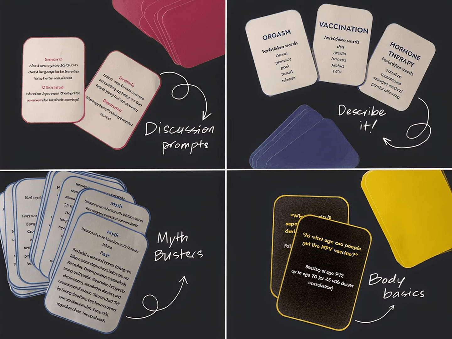
Before and After
The cards were redesigned. We made them bigger, updated the font for readability, and reworked the color palette to improve contrast. If players couldn't read the cards comfortably, the conversation couldn't happen.
DEPERSONALIZE THE LANGUAGE
The question is pointed to the player, which was triggering for someone’s real-life experience.
We depersonalized the card content. Instead of "Your pap smear came back and you tested positive..." the cards now read "a friend’s…" The distance made it safer to engage. Players could respond without feeling like the question was directed at them personally.
SAFETY
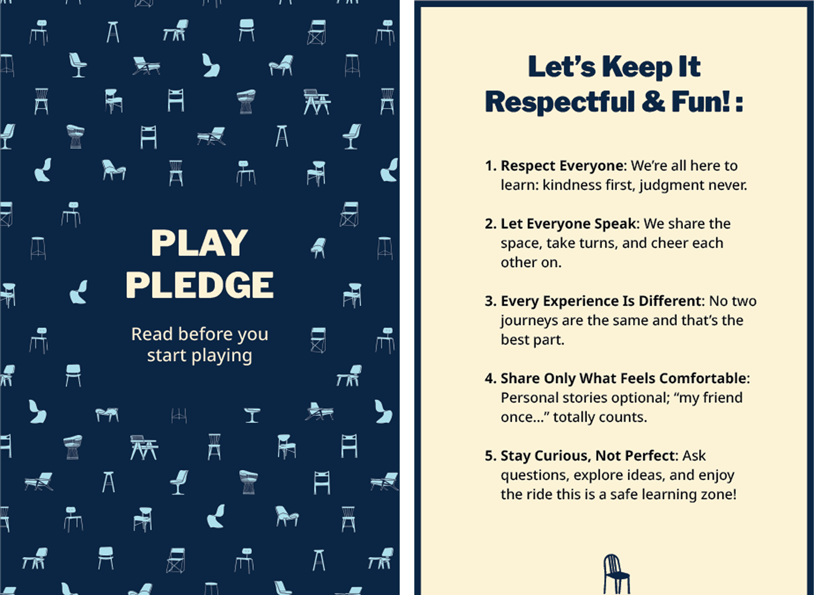
The pledge card
We added a pledge card to be read before play begins: five rules, all framed around warmth and respect. Kindness first, judgment never. Share only what feels comfortable. Every experience is different. The pledge set the tone before a single card was drawn.
REWARDS
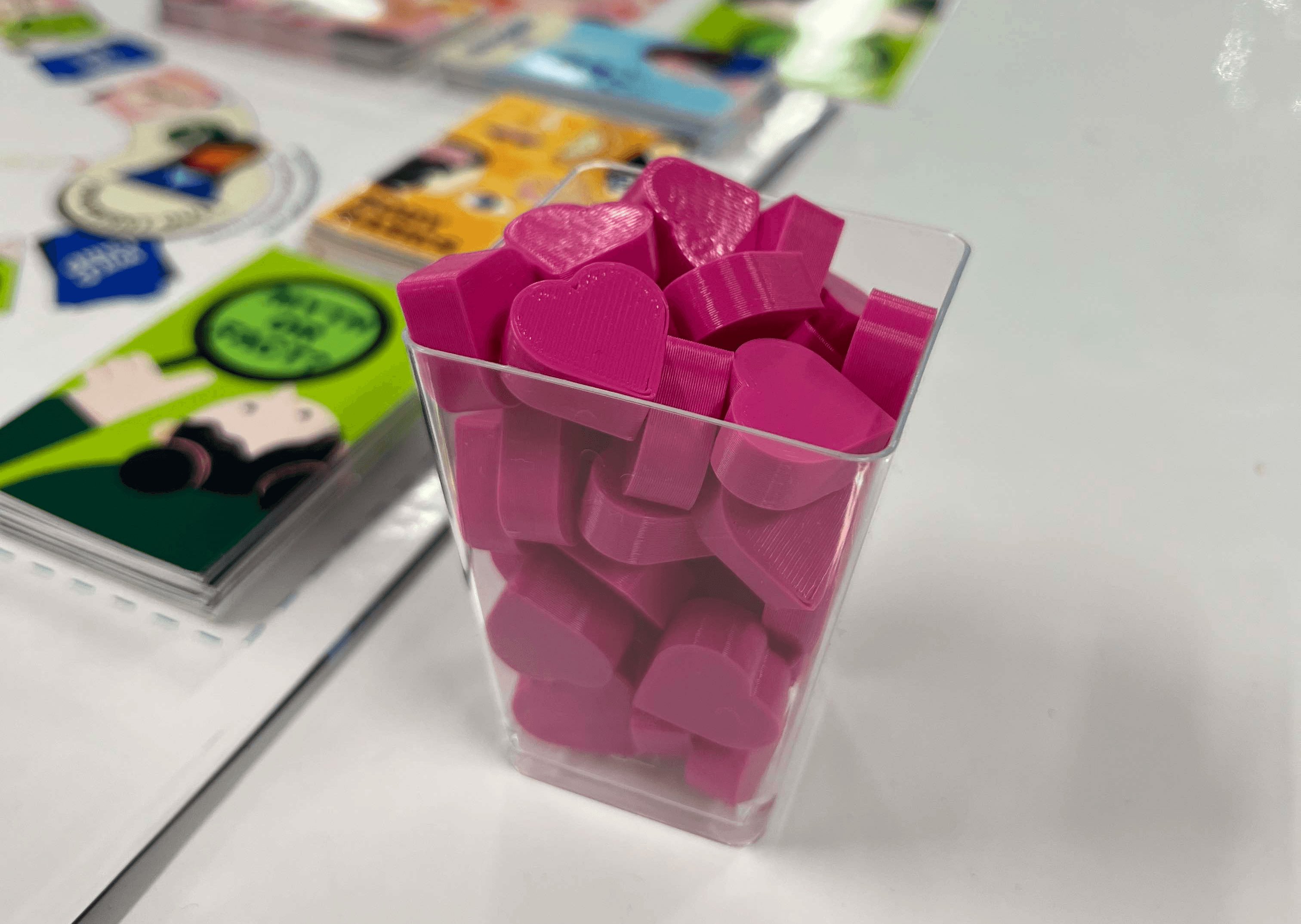
The coins have never been printed, but this is our token rewards
The coins became hearts. Players had already told us during the game that coins felt transactional, it didn't match the tone of what we were building. The hearts replaced that: a small, warm acknowledgment for being courageous enough to speak up.
TOKEN CHARACTERS


Before and After
The token characters were updated, not from user feedback, but from the team looking at what we had built. The game is called "Grab a Seat." The name carries a specific intention: you're welcome here, sit beside me, this conversation is worth having. The original tokens were the same chair in different colors. We changed them to different chair designs to make diversity visible and to make the invitation feel real.
THE TAKEAWAY
The board game shipped. The app is what comes next, once the hypothesis is proven and the conditions are right to build it well.
07 — PUBLIC SHOWCASE
Grab a Seat was played by 15+ players at a public showcase, children, students, professors, community members, and a women’s health doctor among them. People sat down and talked. One participant wrote: “I love this so much. I wish I had this game growing up.”
That was the insight that validated our strategy. The board game was not the only product. It was the fastest way to test the most important hypothesis before building the app: would women actually open up if the right conditions existed? The board game was the proof of concept that told us if it was worth building towards the app.
THE TAKEAWAY
The hypothesis held. Women would talk. They just needed the right conditions. That was the validation the app design needed to move forward.
08 — REFLECTION
The app never made it past lo-fi within the 4 weeks timeline. It became a documented future direction. The underlying need was validated through research, the design was ready. What was missing was capacity.
When I saw the performance gap developing in a team, I did not address it. I was focused on keeping the team moving and I did not want to create tension. So I kept adjusting the timeline and hoped it would resolve itself. It did not.
What I learned is that keeping momentum is not always the right call. Sometimes the most productive thing you can do is pause and name what is actually happening, even when it is uncomfortable. Pushing forward while ignoring a real problem does not make the problem smaller. It just delays the consequences.
GOING FORWARD
When I see a performance gap forming in a team, I will say something. Not as a confrontation, but as an honest conversation about what we can each realistically contribute and whether the scope still makes sense.